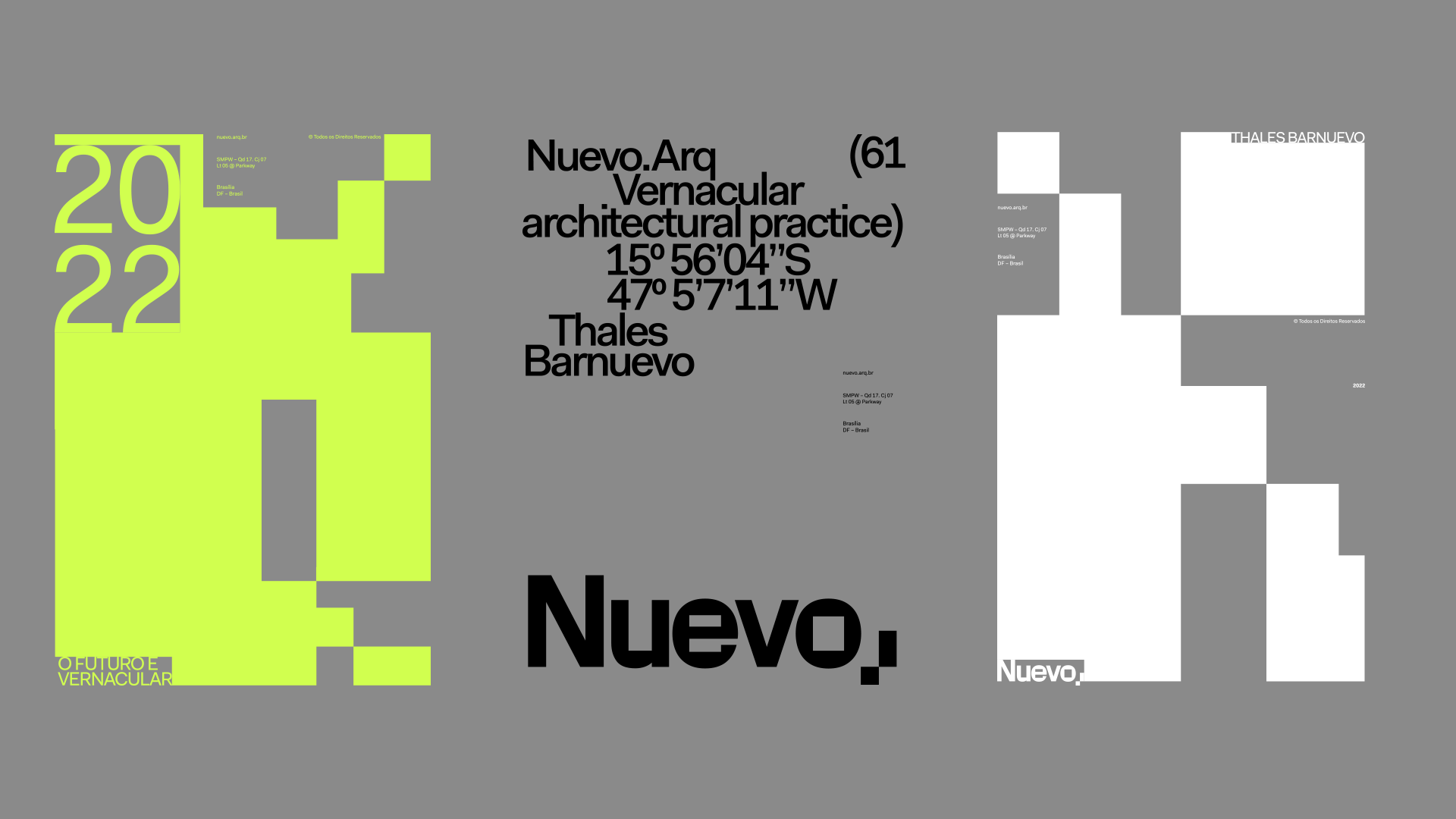
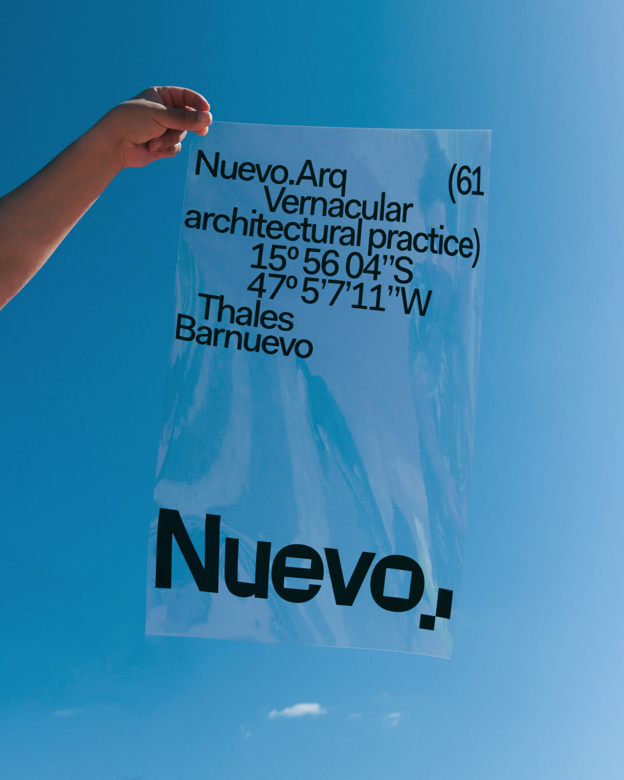
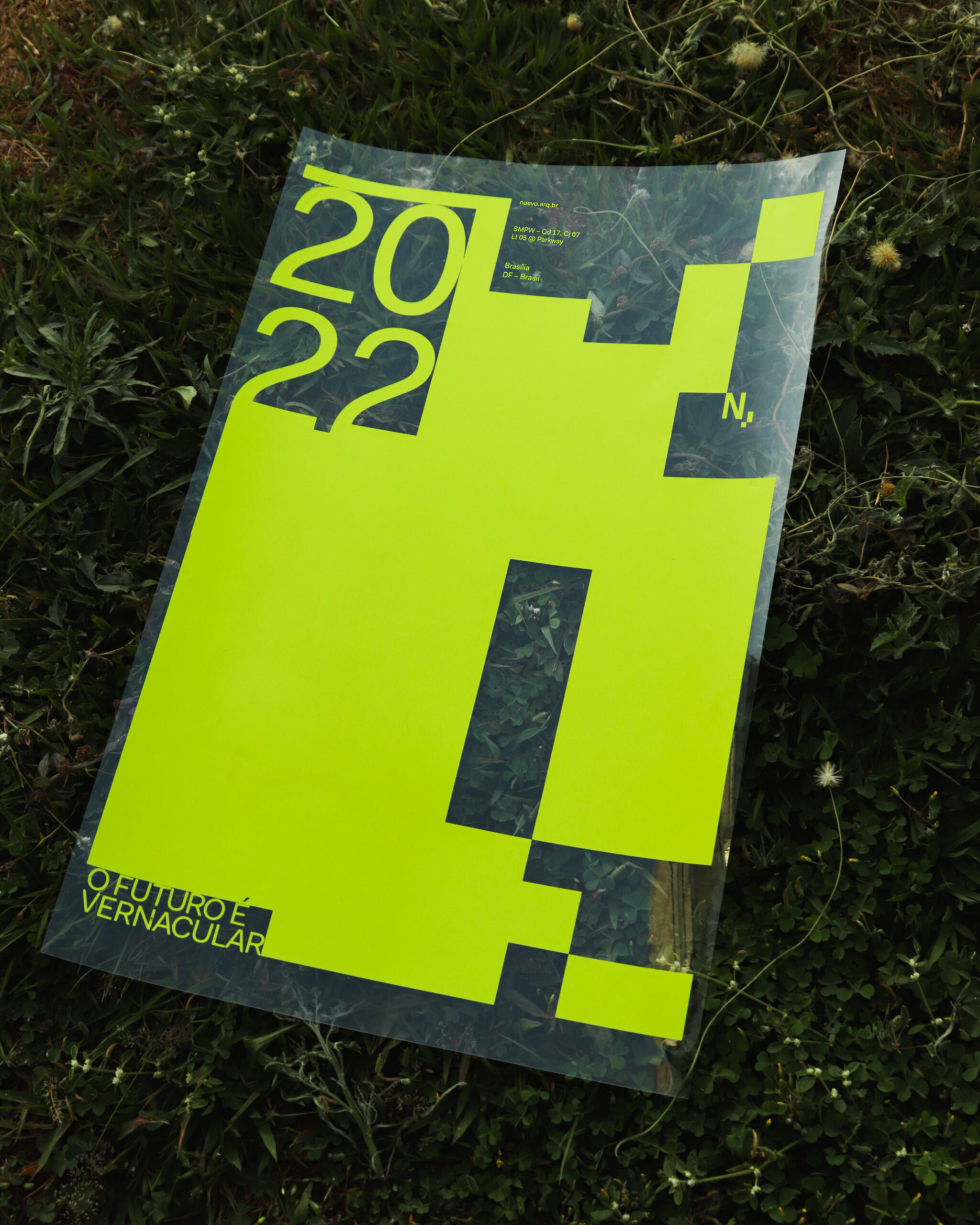
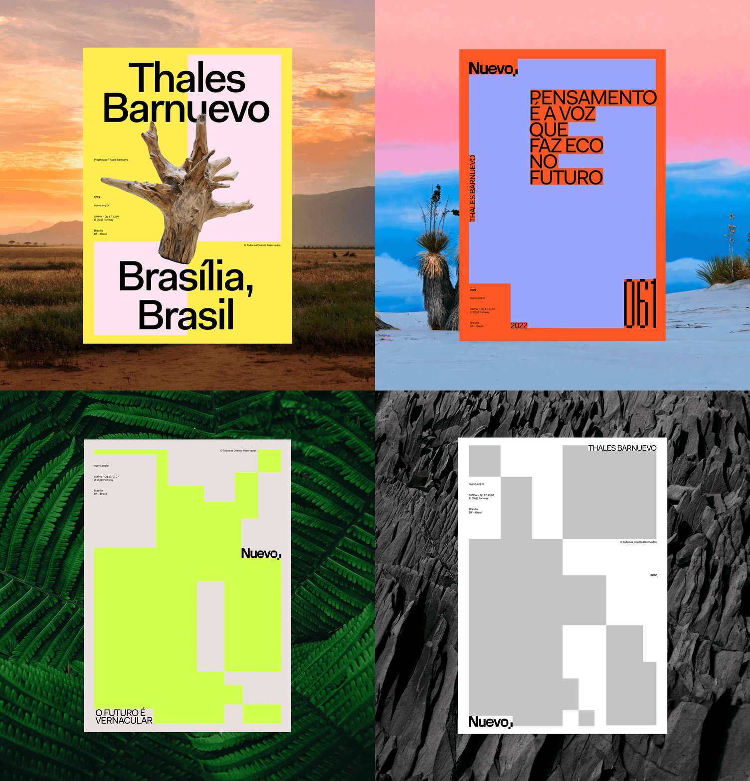
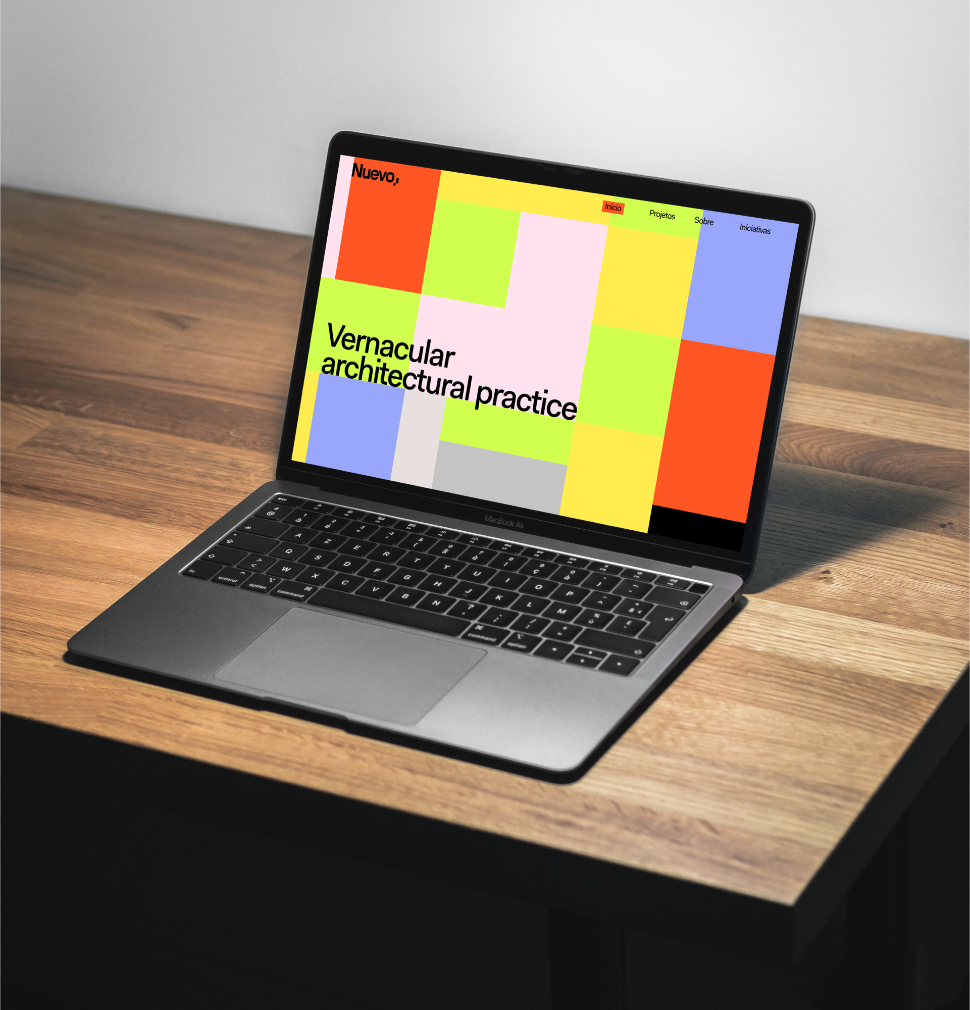
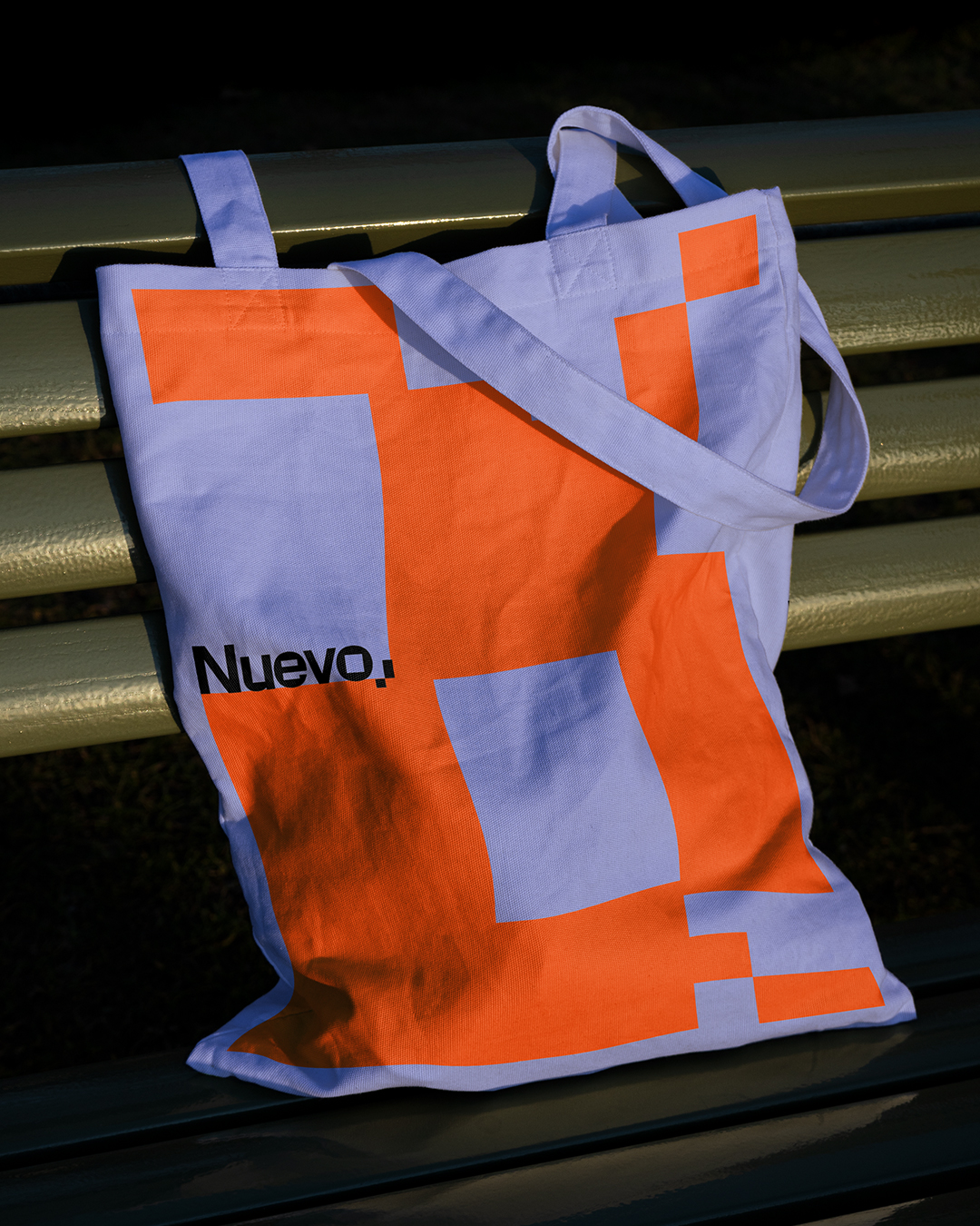
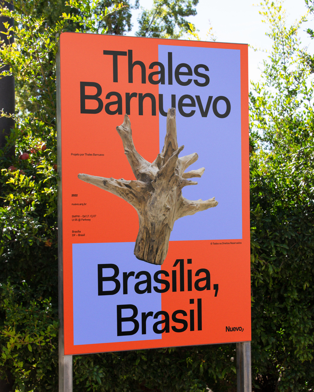
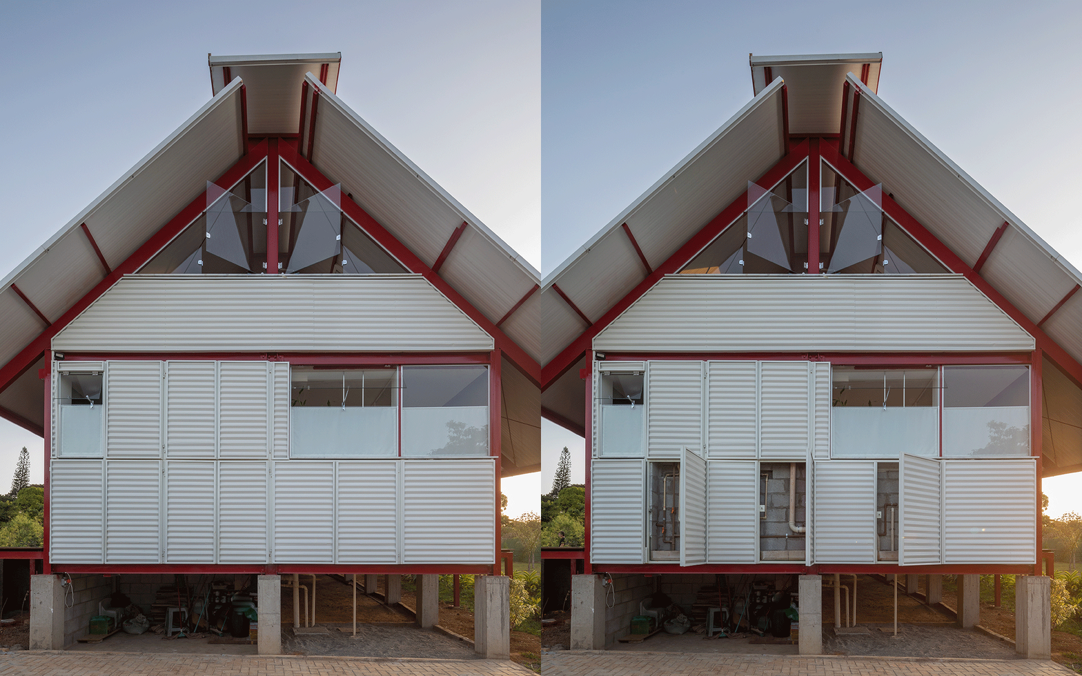
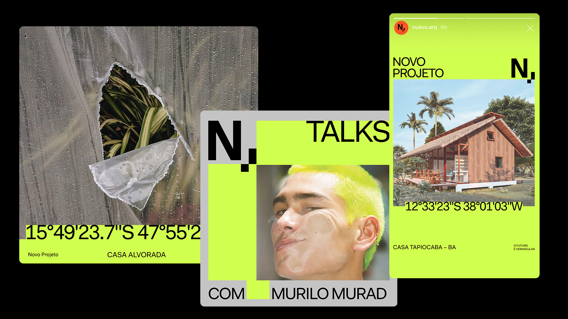
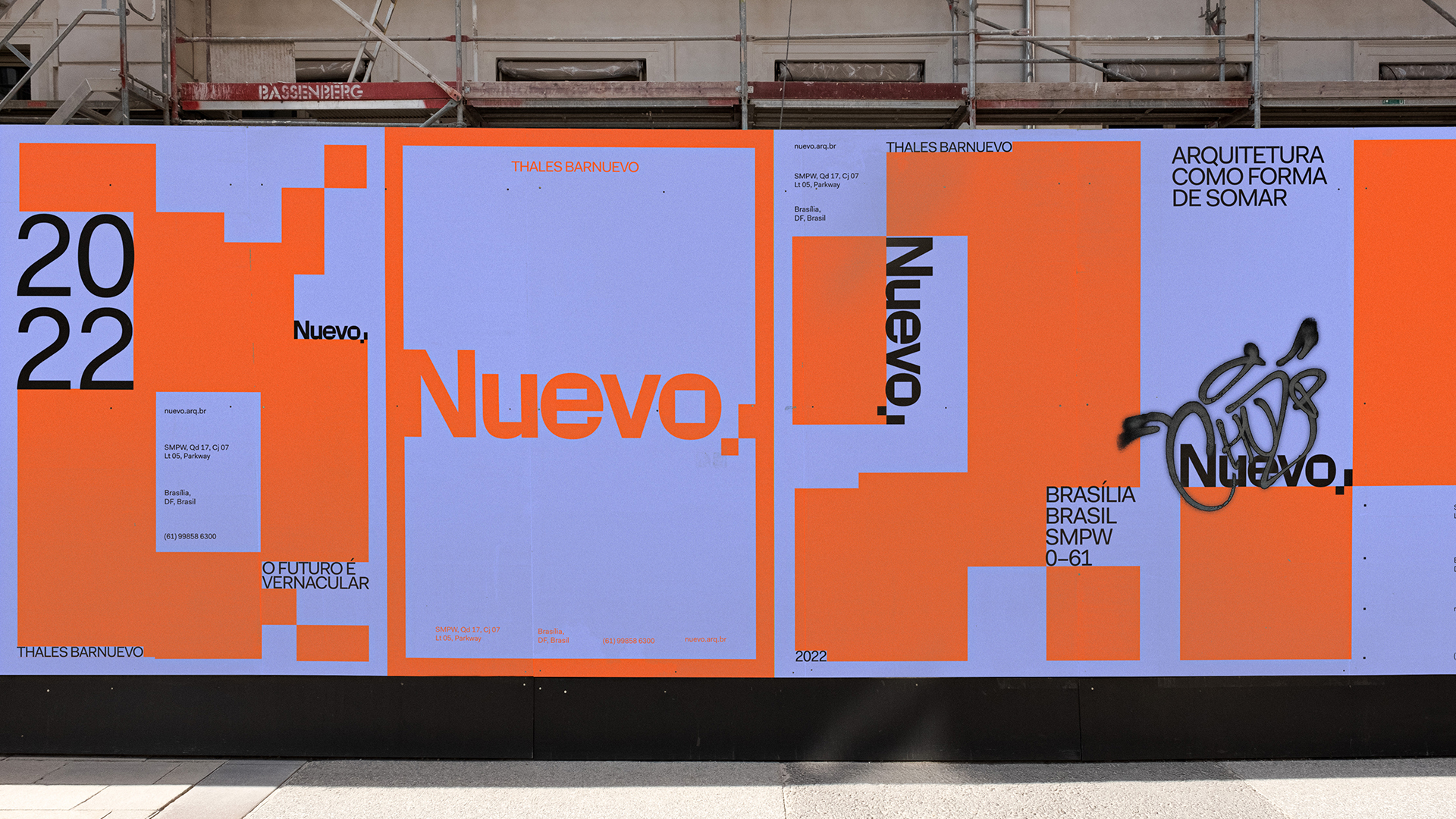
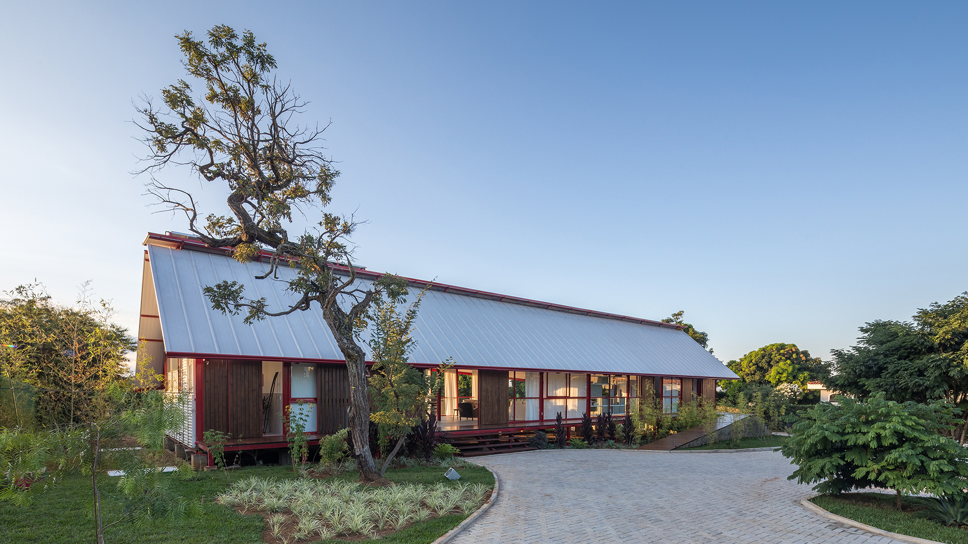
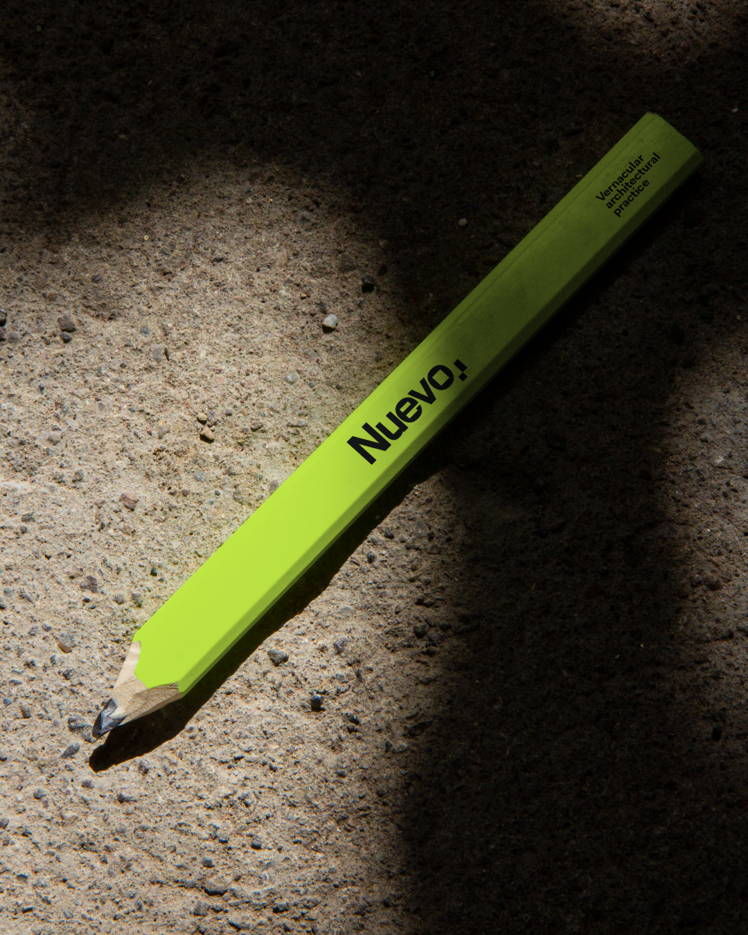
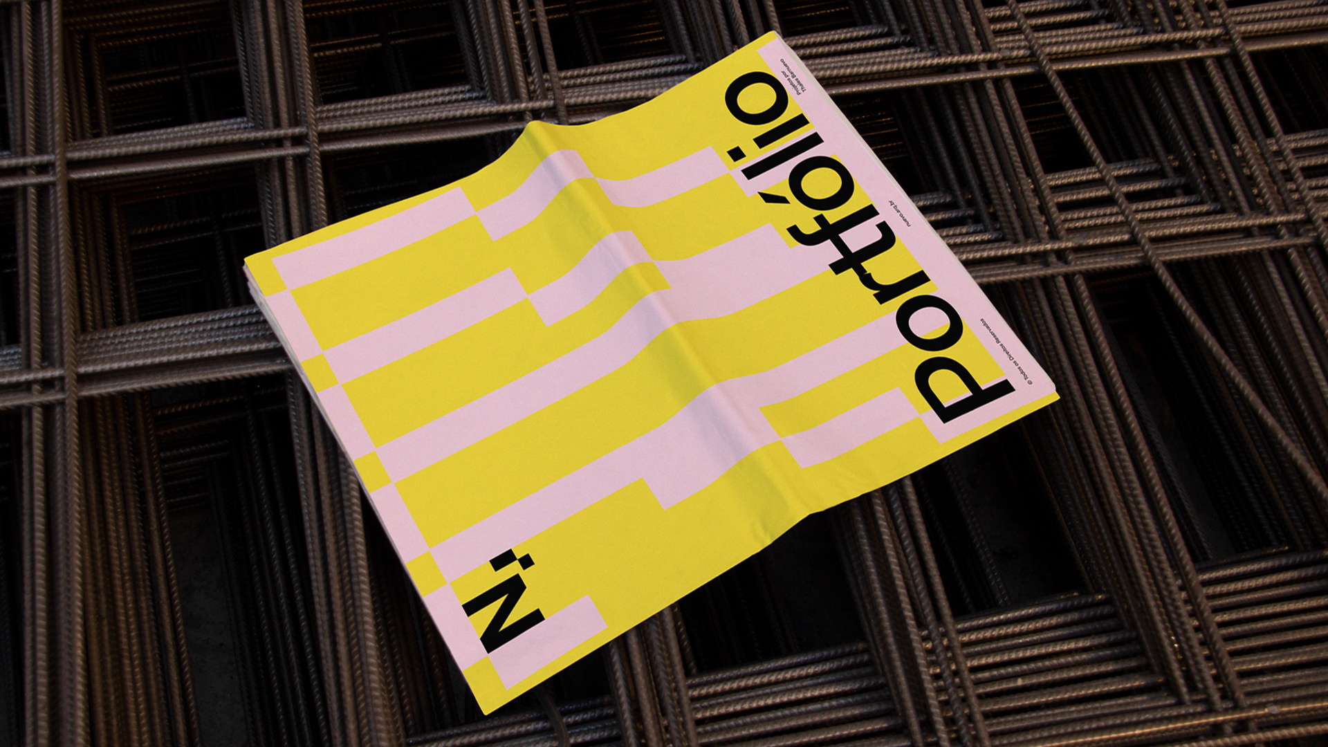
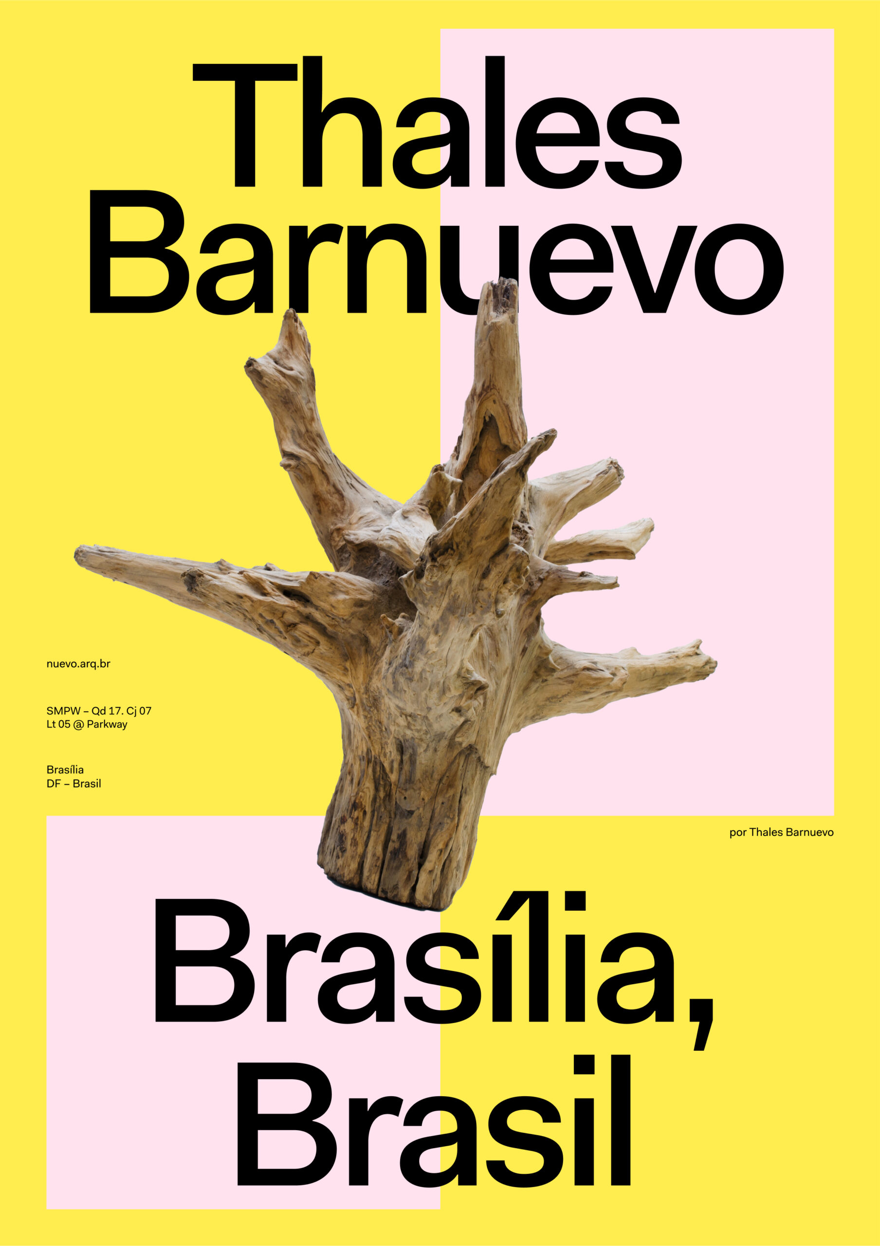
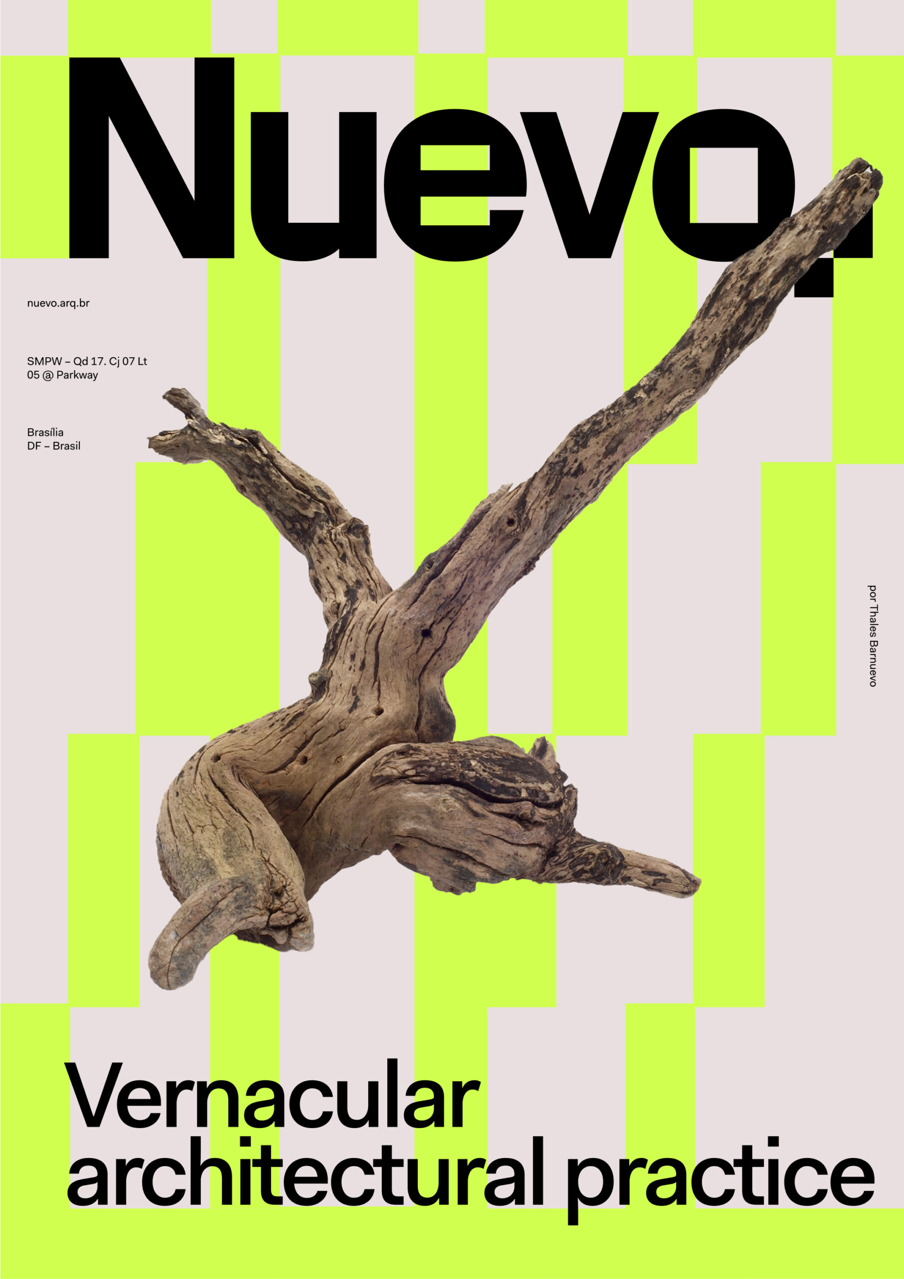
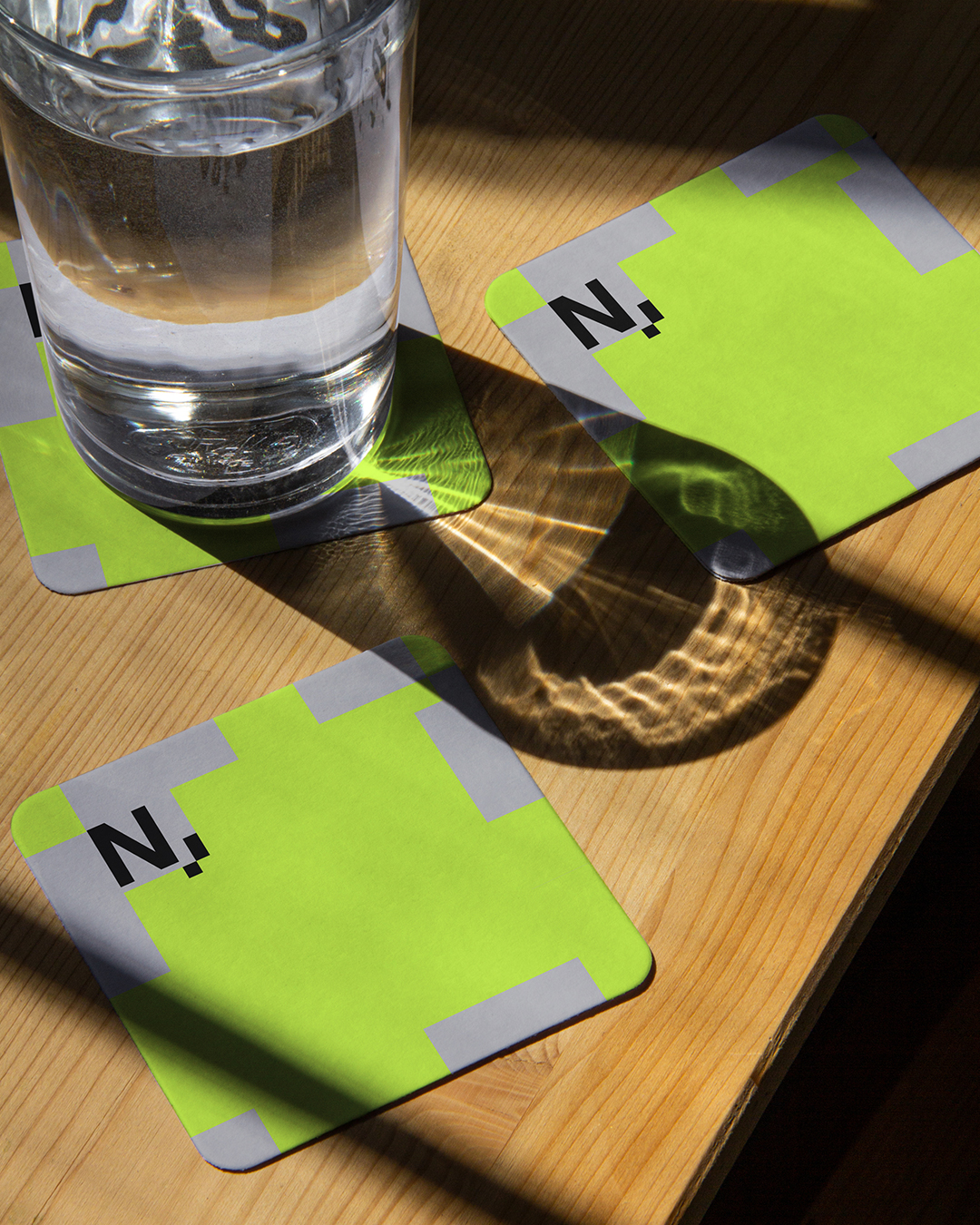
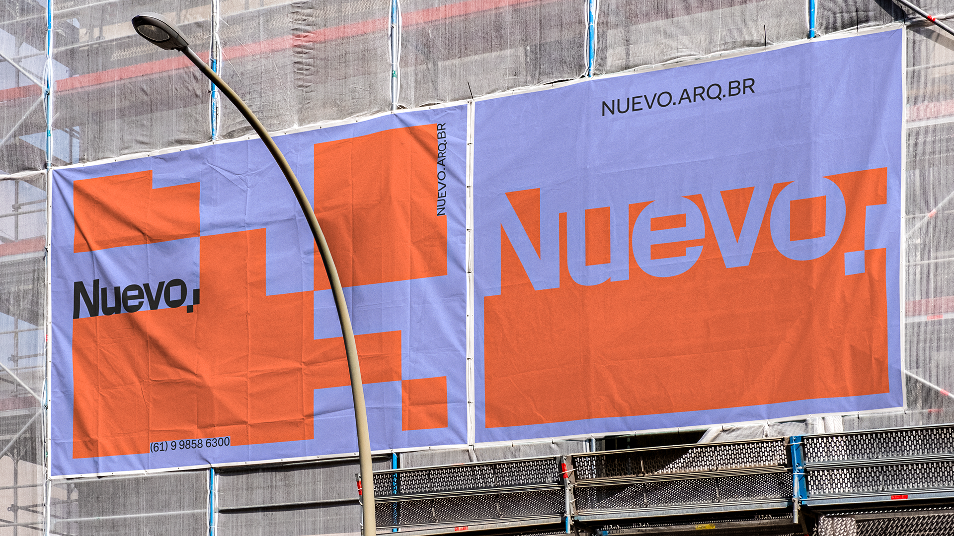
Vernaculity is the main concept of this visual identity, manifesting itself graphically through the use of shapes and against shapes, creating a direct parallel between the relationship with nature (represented by content) and Vernacular Architecture (represented by geometric shapes). The visual system embraces the idea of natural lack of control, with mutable and variable elements, reinforcing how geometry works as a function of content, an idea also represented in the brand’s typographic design. All graphics were made from the semicolon that accompany the name of the office, conceptually suggesting that the city and nature can coexist if there is dialogue between the parties. The chromatic choice also seeks to reinforce vernaculity through the use of colors present in Brazilian fauna and flora.
Client: Thales Barnuevo
Naming: Hermes Miranda
Design: Hermes Miranda and Igor Fajardo
Motion Graphics: Igor Fajardo
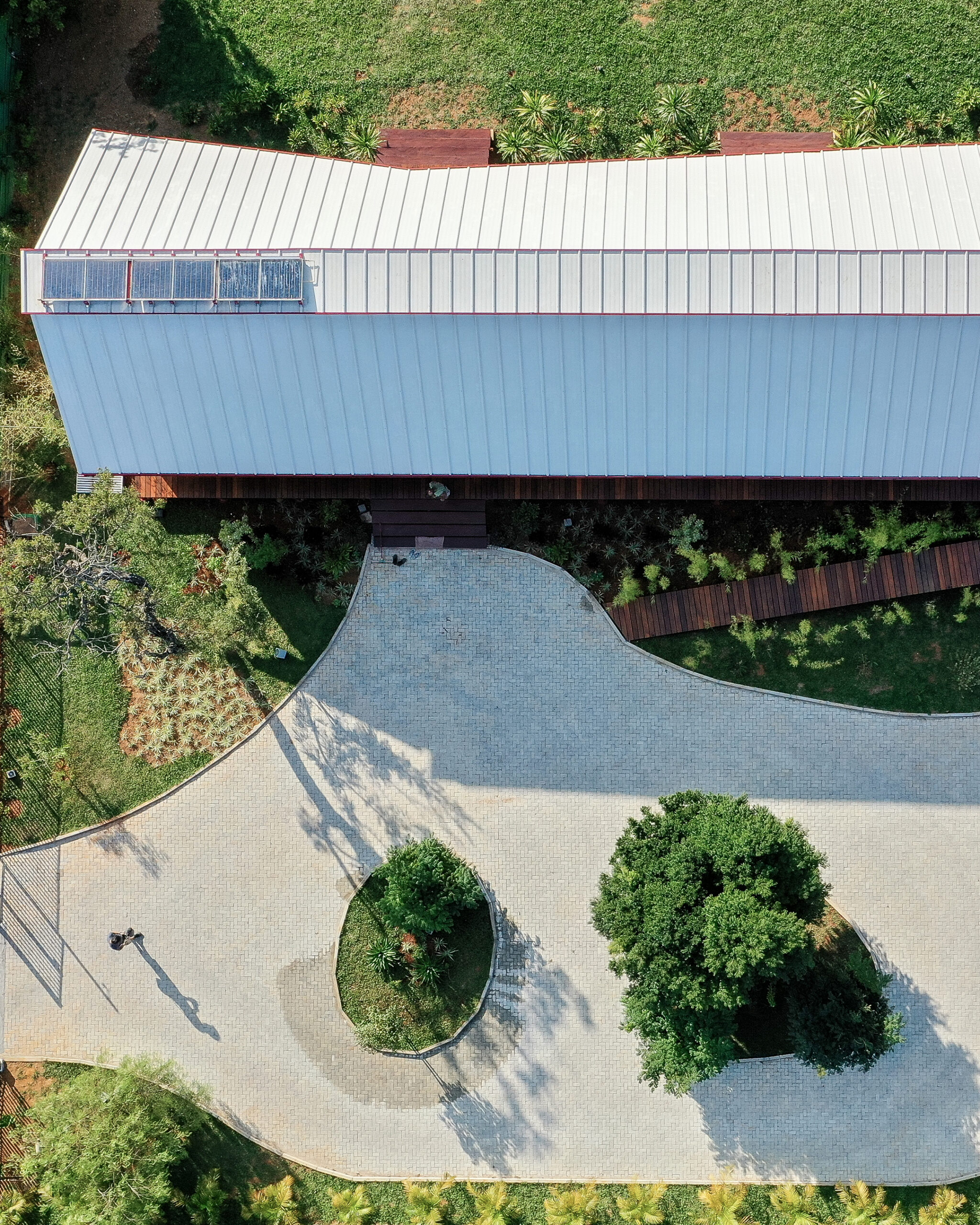
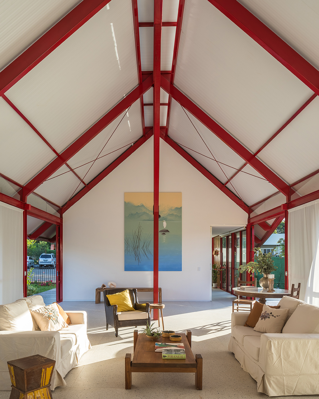
Photography: Haruo Mikami

